Bringing the Thames back to the London tube map
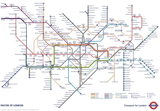
This week Transport for London have released a big revision to the tube map. They are trying to make it clearer. It is a great deal simpler than the previous version, but they may have gone too far. The River Thames has gone:
I think that the Thames is one of the cues that gives some grounding to people who have a look at the map for the first time. In fact the river would fit perfectly well onto the current map as it is (apart from moving one station) if you incorporate a new rule: station labels are allowed to overlap the river.
Here’s a close up of what it would look like:

Instead of simplifying the map too far, here’s a reminder of my design that has all the same information as the previous map and more while being clearer:
For a long page on my thoughts on London transport design, visit this page.
For more radical tube map designs and commentary on the current official design, follow the work of author and designer Maxwell Roberts:

See also:
100 posters celebrating the 100th birthday of the tube logo
Better art on the New York subway


Classic situation of someone with vision and the will do it right, succeeding brilliantly, and someone thoughtless who didnt care, cutting corners, and making a mess. Very cool solution to the map.
I like the way you have solved the problem of step-free access blocking the interchange symbol, but I actually like the darker grey behind alternate zones of the old tfl one (it’s like row shading on a table)
I think the river should come back but without that kink that isn’t there next to blackfriars.
Without that the circle line could be made into a rounded rectangle and so many other kinks/oddities cleared up.
I tried fixing this a few years back (in a paint programme which is why it’s so rubbish, but shows the principal)

I think Boris should run a competition to design the best map, like he did with the buses – the map is just as iconic!
The reason why I left the Circle line as a flask shape instead of a rounded rectangle is that I want the Central line to remain as straight as possible. That means keeping Bank and Monument close to each other. The position of Bank is also defined by the Waterloo & City line being a single diagonal line.