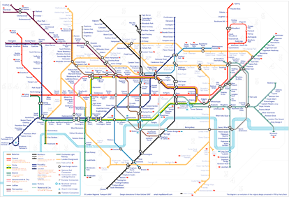
Tube map visitors – a huge version
For those of you visiting from the BBC iPM blog, here is a very large version of my suggested design for the London tube map. This is a version that illustrates the system as it could be in 2012. That means a more extensive London Overground network, some DLR changes and the completion of the station changes around Shepherds Bush.
For more on the design, see my page on the design of London’s tube map.


I like it, though I do have a couple of observations:
London City Airport DLR is missing its ‘Airport interchange’ icon.
How is the DLR geographically? TfL’s map has the two branches running in parallel, while you have them at right angles.
You’ve lost the “change here for a service to the airport” icon, which I think was useful (though it would have been even more useful if it said which airport it linked to).
I like the inclusion of Thameslink, though it isn’t obvious that that isn’t the entirety of the Thameslink network.
You’ve lost the information about wheelchair accessibility. I don’t really like the way the current TfL version does it, because it loses the distinction with interchange station, but it would be nice to include this information if it is possible. (Someone elsewhere suggested that it might be done with the colour of the station name, though that might be messy.)
How about doing a version including the current Tramlink line, and a 2018 version showing Crossrail (some of which will almost certainly be included on the TfL map) and the Cross river tram?
As I say, I like it, better than the TfL one.
Just noticed one other thing – your legend doesn’t include a description of what the restriction at Temple is.
Yours is definatly the best idea on the iPM blog for the transport map. Awesome job