If you want to see the current London tube map, visit this page on the Transport for London site.
I set this page up in response to the BBC making a radio/blog item on whether the current design of London’s tube map is a lot less ‘classic’ than it used to be:
A classic that has lost its way

Current version – Click for PDF on Transport for London site
An amateur responds
I think my version is clearer and looks better than the official one:

For a large (3000 pixels wide), click.
Comparison in one graphic.
I think that this supposed ‘design classic’ has lost its way in the last twenty years. Some rules remain despite the reason for their introduction having long-since become out of date. One of these is making the map work when people photocopy the map and all colour is lost. As colour prints now seem more convenient and cheaper than photocopies, the rule that map must work in black and white can be dropped.
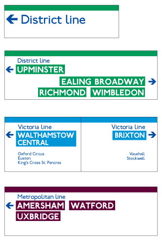
If you go to Maxwell Roberts’ page on why the official design is terrible, you’ll see why a major problem is the official insistence that a large disability symbol be used to indicate step-free access to some stations.
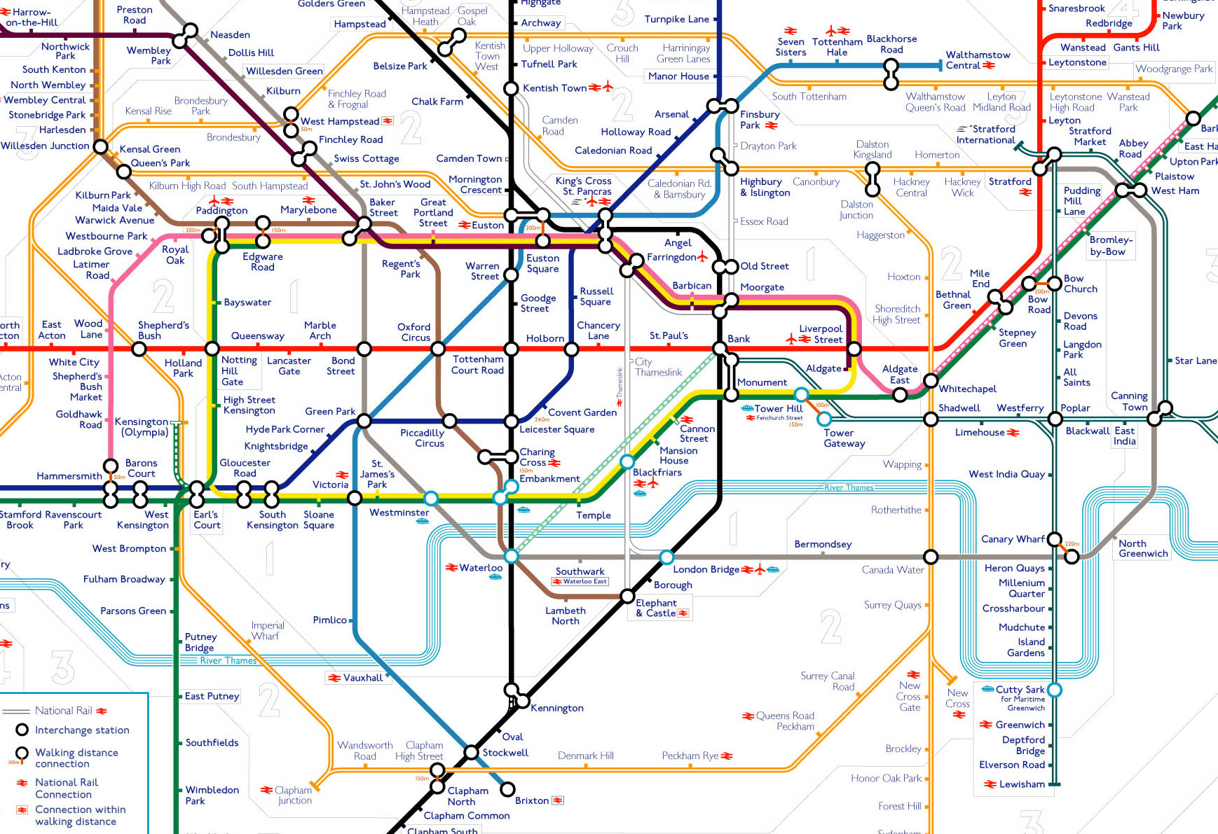
In the tradition of amateur contributions to the design evolution of the map, I’ve come up with a version. I’ve incorporated all the information from the official map, yet toned down the symbol of step-free access. I’ve kept in national rail lines that go into the centre of London by tunnel. I’ve also shown which stations are near to each other above ground.
I think that older versions of this map reflected an artistic aesthetic as well as the need to provide useful information. There’s no need for the ends of the Central line to look as they do on my map. I think they look better that way.
Information design
I believe that prior to the 1990s the design of the map helped people oriented themselves by noting whether they were to the left or the right of a straight Northern, and above or below the Central. Under the section of changes to make routes clearer: to show where there Jubilee went, I thought best make it straight towards Canary Wharf; to help people choose The Waterloo and City outside the peaks, best make it straight. I also wanted to make the DLR clearer (and better looking!)
It’s best to indicate on the lines themselves those that do not run full time. I’ve added a dashed white line to these services. I’ve also marked stations with limited opening hours with a hollow tick mark which should prompt people to look at the key for further information. I think the traditional dagger symbol could be overlooked by many.
I also fixed some geographical anomalies where possible: the relative alignment of the Victoria and Overground line, the proximity of Regents Park and Great Portland Street station and the relative positions of the two Edgware Road stations.
Aesthetics
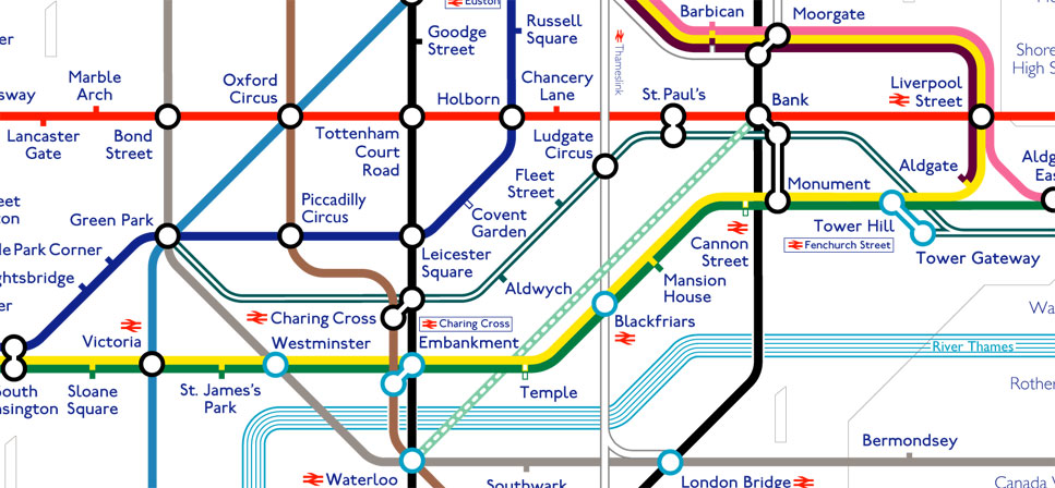
I liked it when Epping and West Ruislip reflected each other. I liked it when the eastern District was straight. I also wanted to make the central area (Bond Street to Holborn) to be more geometrical. I also used a lighter weight type for the Overground line stations.
The trick is to have all this content while making the map look as clear and beautiful as the 1970s version:

Click to enlarge
(from The London Tube Map Archive)
For much more on the evolution of the map, visit the official site for a book on the design of the map since the 1960s.
A suggestion from Paris
As the London tube system will only get more complicated, maybe it is time to consider using an idea from the Paris Metro: make more of names of the terminii of each line. I think that one of the biggest problems for new users of the system is the use of compass-point directions (‘Eastbound and Westbound’) at tube stations.
Sometimes I need to change at Westminster. When I do, I see that the Jubilee platforms are labelled as being for trains going ‘Westbound’ and ‘Eastbound’. Surely from the point of view of most Londoners, certainly for those who navigate by the tube map, the Jubilee line goes north-south at that point, and the sub-surface lines east-west. The District and Circle aren’t marked as going Northbound and Southbound at Westminster (which are the directions it travels at that station).
Both the Jubilee and Bakerloo lines leave Baker Street to the east. Their platforms aren’t described as Eastbound.
Signage could look like this:
With a revised (2012) tube map looking like this:

Thames Gateway excursions
Various extensions to the DLR are planned.
One that has a serious chance of success is one from Beckton to Dagenham Dock. That might be co-ordinated with an extension of the Overground to the same station:
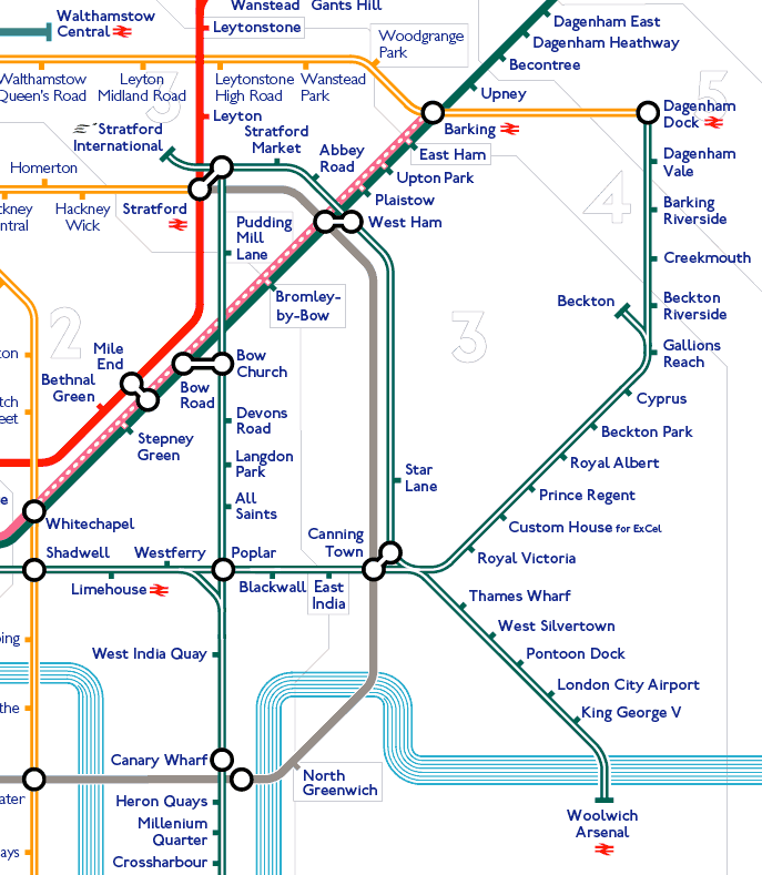
There was talk of an extension to Charing Cross station. That would revive the original Fleet Line plan that connected Charing Cross with Thamesmead. There are some disused Jubilee Line tunnels between Green Park and Aldwych, so why not connect the DLR with Green Park too:
With these extensions maybe it will make more sense to rename the DLR to the Thames Gateway Railway…
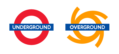
London Overground logo
Transport for London have come up with a plain logo for London Overground. Some say this is because they want to have a ‘soft launch’ – there’s no point in getting Londoners excited when nothing much has changed. Maybe the branding could be stronger once the new trains and improved service arrives. The logo could match the shape of the network:
Quicker by foot?
One of the disadvantages of Beck’s diagrammatic system is that people may not realise how close some stations are from each other. Here’s a new rule for the map that shows distance in metres between stations – when on the same line and when on different lines:
The hardest part of the map to show this with is for Bayswater and Queensway:

The new Outer Circle
Over 100 years ago, the private companies that built the early London Underground planned an ‘Outer Circle’ line to go with the Inner Circle – the line we call the Circle Line.
As Transport for London have taken control of some surface lines and plan to extend the East London Line to reach the former North London Line, the prospect of an outer circle is looking more positive.

To match my tube map design, I’ve used light type for non-underground stations.
December 2007: Future tube map with accessibility information and river services
Posted 17 December 2007

This is my current design for the future tube map. As accessibility information must be included on the map (for political reasons), I’ve come up with light blue markers for interchanges and station ticks. This means that the disability logos no longer overpower the map.
Many think it would be useful to show distances between stations that are physically close but are not connected directly. The new official map is starting to to this, my solution is different. I’ve also shown more links than the current map does.
I’ve found a reason for Beck’s inclusion of the Thames on map – river services are now included on the map – this is not a serious suggestion.
I’ve also shown the proposed service changes for the Circle and Northern lines. I’ve called the new separated service “Edgington” in the tradition of the Bakerloo. Maybe Kennware would be a better name…
September 2009: The Thames and zones vanish
This week Transport for London have released a big revision to the tube map. They are trying to make it clearer. It is a great deal simpler than the previous version, but they may have gone too far. The River Thames has gone:

I think that the Thames is one of the cues that gives some grounding to people who have a look at the map for the first time. In fact the river would fit perfectly well onto the current map as it is (apart from moving one station) if you incorporate a new rule: station labels are allowed to overlap the river.
Here’s a close up of what it would look like:

…and the whole map:

For more radical tube map designs and commentary on the current official design, follow the work of author and designer Maxwell Roberts:


Pingback: Connections « Editing organazized
the western DLR extension is a good idea as the jubilee line tunnel is used, waste not want not
you should make a tube map with all the extensions shown plus the crossrail but keep the north, south, east, westbound idea and names on the thames.
add cable car to big future map.
and Croydon tram-link
I really don’t like the idea of working with terminals as destinations. East/West/North/Southbound seems much more clear to me, and I wish the Circle would work with Clock and Anti-Clockwise. In Paris I just got incredibly confused because I had to know exactly what the last station on that line was, which meant that I had to look at a map every time. In London you only need to know in which general direction you’re going.
And in London it is quite common for trains to turn back early, for example at Arnos Grove or Tower Hill. If as a tourist I’m getting on a District towards Upminster and the train doesn’t actually go to Upminster I’d get even more confused.
I like the other things you’ve done here, though. Good work! Do you think there’s a way of making Stratford International – Stratford look a bit more stylish?
Pingback: A classic that has lost its way « Editing organazized
I really like the London Overground Roundel you created! I can really see it working in sync with the 2012 Olympic Games Logo!
George
I really love your new tube map and it certainly harks back to the versions from the late 70s. How would you incorporate the circle line into your destenation ideas? I especially like the way you did the DLR at the east.
This is my plan for getting rid of the whole London Overground thing and disembowling it into Cross London, South East, Outer Circle, North Easten and an extension to the Central Line.
Obviously its pie in the sky because of the technical difficulties, the idea of turning it into an outer circle really appealed to me.
Sorry to post twice but I saw your new map.
It seems to me youve gone completely off track, you have the right idea; to make it into a design icon again but it seems youve gone a bit wrong. Its so much more confusing than when you started. The ticks look odd and the river-boat idea is good but it makes it look clustered.
Youve gone the same way as TfL by trying to show too much, scrap everything that’s not nessercary and just have the tube lines and stations. Disabled information and London Overground are totally uneeded in my opinion.
The original tube map by Harry Beck took something confusing and turned it into something simple and since about 1999 TfL or whatever they were called have taken something simple and turned it into one hell of a confusing mess.
Just a little montage to prove my point.
Hope that came across as constructive criticism and not just me being nasty. Sorry if it did.
I think that including step-free access is a bad idea, yet if including it makes my map more likely to be accepted by the client (Transport for London), I might as well find a better way of doing it than the current version. I’d rather not include the Overground, zonal information, station opening times, airport interchange logos everywhere etc. etc. But as these are required, my task is to make my version better than the other maps with the same information. My job isn’t to decide what to include, it is to make it work.
Oh yes, I definetly agree, and it that sense then obviously you’ve done a really good job. I think TfL is just ludicrous for trying to get all of that information onto a map the size of an A5 (I think) bit of paper for quick reference. Fair enough the big maps outside stations should include this information but the smaller booklet ones should be simple and easy to understand, TfL already make a huge large print version (which I have on my wall) which includes the disabled information.
surely if the northern line was split the charing cross branch would go to high barnet because they switch sides after euston??
i was wondering if you exprimented with extending the bakerloo line down to bromley and the northern down to croydon which have been mooted, and crossrail and chelney
and how do you all these, what software program, because i would love to have a go at doing my own may with my ideas, for lines and how to convey information??
This map is a good idea, i do not like the splitting of the northern line.
The changes planned for the Northern and Circle lines that I’ve shown are the current plans for changes in service. They’re designed to provide more frequent and reliable services.
i know that it is planned to split the northern line, but if you look at the way camden junction is built the trains from charing cross approach camden town on the east side, so would have to go accross the junction to get to the edgeware platforms, you have got the branches going to completely wrong places, the point of the split is to eliminate camden junction.
also thanks for answering my earlier question… i asked you what program you use or how you do it, because i want to have a go, hopefully i’ll get the courtesy of an answer this time!
I really like your new futuristic tube map. I’ve heard that by 2011, the circle line will lose its complete circle and become a spiral line, but it’ll still be called the circle line, but it’ll start at hammersmith up until Paddington to do a complete circle, then terminating at edgware road. I’ve drawn my own London Underground line called the Brentmead line, it’ll be the only line on the whole Underground to breach the M25 twice! The line will start at Brentwood to Redhill via Upminster, Dagenham stations, Thamesmead stations, Fenchurch Street, Aldwcyh, St Pancras International, Paddington, Kensington and Peckham. There is also a branch on the line that’ll branch off from Fenchurch Street onwards to Gordan Hill via Whitechapel, Walthamstow marshes etc.. (I’ve forgotten some of the other stations.) Plus at peak times theres another branch to Enfeild town with no intermediate stations. Trains can also terminate at Upminster, Fenchurch street and Paddington.
Hi, I’d like to ask if your concepts regarding the future maps of LU can be licensed through Creative Commons to a 3rd party. I’m very interested in your ideas and would like to apply it on the future maps of Hong Kong’s underground railway system, which will be part of my virtual railway project. I’m not sure if I’ll make it for BVE or MSTS2 though, anyway it will base on my suggestion on improving the railway system of HK and the government’s proposal on the future railway network.
Cheers~~^^
I think your December 2007: Future tube map with accessibility information and river services is the best, it is clear and still easy to use and that the Northern line is now two differnt lines as this is what TfL wants by 2025. The horrible accessibility have been replaced with a very cleaver idea, i really do belivbe that TfL should use that map, and its still looks ‘classic’. Also the London Overground logo is very good i thought it was also very cleaver and abit more exciting and it would break awa from the rest of the roundals. How did you create the maps in the first place? Email me, i would like to know
Please remove any reference to FWT being involved in the present Underground map. This is WRONG. We have had no involvement in published Underground maps since the 1980s. Please publish an apology on your site. I do not want to be associated with the present map.
Good stuff. Your maps are largely clearer than LU’s current editions.
A couple of thoughts, though. While you’re splitting lines: I’ve never understood why the Wimbledon-Edgward Road service is treated as a part of the District, when it avoids the Earl’s Court-Tower Hill core and is run as part of the Circle/H&C. For a long time it was known on usenet as the Wimbleware service – perhaps you could split this one off, Edgington style?
In the same way, I suspect that, once the ELLX is complete, London Overground is going to be a bit unwieldy to show as a single line/network. Perhaps this could be split into different routes too.
Lastly, in terms of walking connections, Camden Road/Camden Town are only a few minutes apart. For some reason TfL seems reluctant to admit this…
Mr. Rose, I agree that you should not want to be associated with the current map. An assertion that only an evil person would dare make. Sadly, in this case your mention of FWT is the first on this page. That mention was the second.
I think young Smithers should quickly review Underground Maps After Beck by Maxwell J. Roberts. If he reads that he will see that it is those who set the political rules about the map’s design that are to blame.
Jonn, I agree that Wimbleware should be a different line, except I have vague memories of being on a District Line platform at Blackfriars which has listed an immanent arrival by a train going to Wimbledon. The divisions between lines that I show on the December 2007 map are ones currently planned by Transport for London.
Trains do run from Wimbledon to Upminster. My point was that the ones that run Wimbledon to Edgward Road are, in effect, a completely different line to those that run Upminster to Richmond: they use different trains, are run as different routes, are shown on different internal carriage maps, and their only point of contact is using adjacent platforms at Earl’s Court. I’ve never understood why LUL persists with this odd belief that they’re the same line.
I just figured, while you’re doing such a good job of fixing their other mistakes…
Fascinating stuff. I’ve seen the book that shows how the map has changed over the years. I personally prefer the very original one where the routes are aligned more with the actual overground streets so are very curvy rather than the straight lines they use now. As someone who visits London by coach nowadays, I walk most places and the distances on tube maps are completely misleading in every respect. When I used to live in London I used to think how useful it would be to have an outer ring road loop of tubes. To have to go in and then turn and come back out again on another line was very time consuming.
None of us can make any headway against map apathy unless we combine together. A bunch of disparate map enthusiasts spouting forth on the internet isn’t going to convert the politicians Alex suggests control the tube map. The map designer can stand up for his art, if there is the support from a credible lobby.
Does the new Gollner Overground map pay homage to the Circle line car card?
Well done, Alex.
I had begun a part-time project to re-draft the tube map, but you’ve already done it – satisfying all of the parameters I would have aimed for. I really think you’ve hit all the nails squarely on their heads with this. It’s clear, looks professional, uses classic Johnston (which somehow looks so much more ‘real’ and not too ‘corporate’) and contains such clever, yet simple, ideas.
I actually like the idea of using terminal stations to indicate what platforms to go for. I don’t see any reason why you couldn’t have both – OR, simply list the MAIN stations (as you have done) – so, the terminus station PLUS any main/turnback stations en-route. I like the placenames whited-out on a strip of the line colour. Very effective, and very similar to how signs appeared in a dream I once had in which I was in an imagined tube station (in the dream, I dreamed that I was speeding through a tube station in Orpington which looked like St. John’s Wood/Swiss Cottage, also that there was an outlying Piccadilly Line station in Derby – and I was just as shocked in the dream to find out I’d ‘never noticed that before’, there was a station whose building seemed like an historic museum-like place with nothing but steam trains and old frames photographs to look at, and hardly any actual service trains. Maybe that was Ongar trying to find a way of embodying itself – and walking up and down a seemingly never-ending myriad of escalators in a JLE-like station where I could see lots of signs in turquoise showing a forward-facing arrow and the legend, “Canning Town” in white lettering).
Very interesting stuff. I personally think the whole notion of named lines is a nonsense. Names are cumbersome and limiting. “Edgington” best avoided. Much simpler to have them numbered in my opinion. And particularly in the case of London Overground, which to my mind is being branded as an old-fashioned railway – not a “METRO”.per se i.e. I’d like to see segregated, distinct, split, numbered lines, with separate colours on the map. London Overground Line 1, Line 2 etc. Definitely NOT things like “East London Railway”. Sounds like a return to steam!
One question – how on earth do you build these diagrams? Does tfl give away its design system?
Some great work – your simplification ideas mostly work really well.
A comment on the Parisian system of using end stations to denote direction – it is completely useless to anyone who doesn’t happen to know where Clignancourt or Pont de Sevres is. I even struggle as a Londoner to remember where Uxbridge or Barking are – whereas northbound, southbound etc makes instant sense.
Luke’s comment makes sense – usng numbers for lines that split can be more memorable than a destination name. TfL could additionally use German-style line numbers to make the District line clearer, for example – D1 to Wimbledon, D2 to Richmond, D3 to Ealing, D4 to Edgeware Road, D5 to Barking. Same for Overground, Central, DLR, Met, Northern…. How many times have I got on the wrong train becuase I couldn’t remember where High Barnet actually is? But remembering to get on Northern line N2 would be so much simpler.
I definately think that this is an improvement on the map, particularly as the ‘Overground’ (suitibly unimaginative name don’t you think?) isn’t, by many, considered as part of the Underground network. One possible suggestion – your surface links between stations I think the line should be under the station markers and not over them if you see what I mean. (I’m not too good at describing things…)
Richard, I have the overland links (in orange) over the interchange circles because the links would not be visible the other way around when the interchange circles are very close – such as at Regent’s Park/Great Portland Street, King’s Cross St. Pancras.
Thanks for checking my map out.
Hello Alex. I must say I thoroughly enjoy these map. 2 quick questions: What software was used in the creation and are you using Gill Sans or Johnston for the maps?
I had the idea of merging several other proposals and shorter lines into one large, extended Northern City Line. This line would start at Clapham Junction, run through Battersea Park to Vauxhall, then across to Kennington and up to Waterloo, connecting with the W&C. From Bank, it would link up to Moorgate, then along the Northern City to Finsbury Park, then following the old Northern Heights proposal to Edgware, with a slightly revised route to Bushey Heath and across the Croxley Link to terminate at Watford, with reservations for services to Alexandra Palace, Chesham, and Aylesbury.
Oh, the wonders of fantasy.
Jason… Adobe Illustrator and Gill Sans Light for Overground stations, P22 Johnson Underground for everything else.
I grew up defacing my parents copies of the London Nicholson Street Atlas and Geographer’s A to Z by drawing tens of imaginary lines between streets all over town!
Just Wondering, where did you get the P22 Johnston Font?
I bought ‘Underground’ from P22 on a floppy disc back in the 90s.
Thanks for that. Is there a way to take the actual lines themselves and redraw them (or at least move them around the map)?
Jason, there isn’t publicly available software that moves the line, all stations and all other lines connected to it. You use Illustrator to move each line, it’s stations bit by bit.
That’s why it takes many hours just to get a map you can edit.
Very interesting site and useful comments for the work I am doing elsewhere on a network map.
The London Overgruond looks remarkably like the 1969 Merseyside Passnger Transport Executive symbol known as the “barbed wire” or “Catherine wheel”. Some suggested it referred to the 1969 creation of MPTE!
Thanks Mark
That logo looks harsh. At first viewing I thought it was an aerial shot of a lawn display…
Nice map, although one slight criticism. The point of the interchange icons, particularly at Bank/Monument and King’s Cross – St Pancras is to generally show escalator routes between lines. For example, at King’s Cross, there are three main areas: Circle/ Metropolitan, Northern/Piccadilly and Victoria. This is shown on the official LU map by grouping the above lines together. However, on the amateur map, this is not regarded as the Piccadilly line is paired with the Victoria line rather than the Northern line.
I like you taking off the wheelchair symbols but your choice of colour and tick symbol is equally distracting. Could you try just a different lifestyle (say dashed, outlined or thinner) but keep the interchanges black and the stations the same colour as the lines? I really don’t think the map wants another colour for stations.
The other issues I have is Liverpool St. is just too far away from Moorgate and Blackfriars too far from the Thames, can these be moved closer although I can accept West Ham being distant to Canning Town to enable the eastern lines to stay on the page.
Dave, the problem with not changing the colour of the interchange stations would mean I’d have to find another way to show step-free access. The other options are making the step-free interchange stations a different shaped symbol, or adding a symbol after the station name. That means I won’t be able to show when step-free access when it only applies to some of the lines.
As regards Liverpool Street, the primary information design idea is for the Central Line and Northern lines to be as straight as possible. That is more important than those very long stretches of line around Liverpool Street!
What a great achievement! Your maps are much better than the current TfL ones. I find the re-inclusion of Thameslink lines etc a bit distracting(why not other mainline routes all over south London – just as useful); but otherwise it all nears perfection in aesthetic and practicality terms. It’s no use people asking that we don’t have step-free access symbols on the map. Disability lobbying and legislation is too vigorous and, in all fairness, probably rightly so. But I think your solution is much more pleasing to the eye, though unlikely to be accepted for the usual boring standardisation reasons. Your map for London Overground is great but I think the redesigned roundel is a bit daft! You’ve put a lot of work in – perhaps you should go and pitch it straight to Peter Hendy?
How come I do not see the National Rail Logo at West Ham when the C2C which is a national rail train stops at West Ham.
Visually, logically and on many points of detail this is much superior to TfL and deserves their serious attention. The straight Central and Northern (though please not ‘Edgington’!) is key to this, as is some kind of symmetry around the edges. The treatment of Paddington & Edgware Road for teacup/lasso trains is as clear as it’s possible to get. Two comments:
(1) While it’s good to show additional walkable connections (e.g. Great Portland Street / Regent’s Park) it’s misleading to mark them as interchanges since they are ticketed as separate journeys [would that we had proper tube/bus/train/riverboat transfer arrangements. like most European cities….]
(2) how far can interchanges reflect the reality of walking distances (important both for Londoners and visitors)? For instance, Bank DLR to Drain suggests this is somehow via Northern and Central; Embankment suggests that District & Circle to Bakerloo is more direct than to Northern – neither of which is true. Ditto, I think, at Waterloo, Baker Street, KX and Stratford – all of which admittedly present difficulties!
hi alex
i love your maps and also your overground logo. mabey you should consider a 2017 map with crossrail? also, what softwared do you use to create these grat images?
Thanks,
Chris
p.s. i prefer kenware to edgington!
Hi Alex,
I’ve recently begun to design my own version of the Underground map. I love your version, and you’ve had some great ideas. Have you thought about including the Olympic Javelin (St Pancras to Stratford Int.) on your map?
Also, with the split of the Northern line, wouldn’t the Edgware trains run via Bank, and High Barnet trains via Charing Cross? I think that’s how it used to be. And it would mean not having the complicated crossover at Camden. You could then place Mornington Crescent on the Eastern branch (between Euston and Camden) as it should be.
I’m trying to work out a map that has the Circle line as a perfect Circle. Issues I’m having:
1) Bank/Mounument – it’s difficult to get the Central line from Bank to Liverpool Street, if both are placed on a rigid circle. But if one moves the station to outside the Circle line, it works quite well.
2) Paddington and Edgware Road – I propose changing the name for the Bakerloo ‘Edgware Road’, and also the two Hammersmith stations.
3) South Ken/Gloucster Rd – the piccadilly line passing through both stations, makes this a tricky area of the map too, but I think I’ve solved it.
I’d love to show you some of my ideas and my design, but I have produced mine by hand on paper. I’m not too technically gifted.
Thanks again for an interesting read!
Kez
Good to meet you at the OpenStreetMap meet-up last night Alex. I realised I should’ve told you to chat to Steve Chiltern (the chap with the big beard) about his tube map based on OpenStreetMap. All open licensed of course!
I would personally show the different routes separately on the Docklands Light Railway, District Line and London Overground – perhaps with different colours or route numbers. They are difficult for the newcomer to navigate using the official tube map, as each have numerous branches yet are only shown in one colour. This will get even worse with future extensions to the DLR.
Personal I really hate the current DLR map.
What it needs is a local East london Map, with each of the 4 different DLR routes on it.
The main central london map is OKk in my book.
** Keep it simple ***
🙂
The same could be said for the Overground routes. There are already three with more to come next year. Then there’s the Metropolitan and District lines…
As far as I know, the Eastern run of the [Camden Town to Euston] leg *does* run through Mornington Crescent, **BUT** the crossover of the lines at Euston means that Mornington Crescent is on the bit of the line that carries on through Charing Cross: http://solo2.abac.com/themole/geo_tubemap.gif — http://web.archive.org/web/20060416123536/www.simonclarke.org/lul/maps/lul.gif
What I am not quite clear on though, is which branch Northwards beyond Camden Town naturally carries on from the line naturally(*) containing Mornington Crescent. I believe that trains coming from Edgware would naturally(*) go to the Bank branch, and trains from High Barnet and Mill Hill East would naturally(*) route to the Charing Cross branch, and would therefore also pass through Mornington Crescent. I think numerous other places confirm that. ([*]By “naturally” I mean that the lines do *NOT* cross over just south of Camden Town.)
If future plans are different to that, some tunnel realignment will first be needed.
The signal diagram at http://www.trainweb.org/tubeprune/Camden%20Town-lct5-10.gif could support your position. On the other hand, http://www.geocities.com/athens/acropolis/7069/ltcamden.jpg doesn’t show two tracks going straight white the others twist.
However, it is known that the proposed spilt is to keep the branch in the west connected to the central section that is to the west and the branches to the east connected to the line on the eastern side of the centre and down to Morden.
That would be an easier split for passengers to understand.
As regards ‘natural’ – given that the trains have run through either combination of tunnels for over 75 years with no problems, why would you need to realign the tunnels?
I was under the impression that you’d need to realign the tunnels to avoid permanently crossing over the crossover, but http://www.geocities.com/athens/acropolis/7069/ltcamden.jpg gives a whole new clarity to the layout information.
So the choice becomes choose to pair the lines that continue in a straight line, or keep East with East and West with West. I guess it could go either way.
(By the way, *all* GeoCities sites are being deleted by Yahoo in a few weeks time; who is taking steps to preserve that information?)
Hi Alex,
I like “redesigning” the underground too, but I’ve not found a decent application to do it. I was wondering what you use to create your maps. I have an iMac at home, which may or may not complicate things!
Thanks,
James
Adobe Illustrator – any version will do.
Nice design, but I just thought you’d like to know that “Millennium” (as in the mysterious new DLR stop “Millennium Quarter” is spelt with two Ns.
I love your future version of the map, and my opinion it should be used by TfL. I glanced over the Overground logo without reading your explanation, and then realised that it was the shape of the network without needing to here it from you – so that logo makes a lot of sense 🙂
I like many of your ideas, although I think Hampstead Line is a better name for the split northern line service – it reflects part of its original name. And I don’t care for the colour! I think the map loses something by not having 2 strong colours form the vertical/horizontal axis.
hey alex.
sorry to be pedantic and nitpicky but just to let you know that on your map where you have replaced the missing thames, Woolwich Arsenal DLR is north of the river, whereas in real life it is south of it. just a minor point.
also, i would wholly appreciate it if you posted a tutorial on how you make your maps on illustrator! i’m not sure of the best way to do it.
thanks, Chris.
You’re right, but the map was to illustrate that the Thames fits the riverless map pretty well with no changes.
As regards using Illustrator to make the maps, the art is in making changes to the official map. It’s a matter of selecting the right points to move after locking points and lines you don’t want to move (once you’ve created your initial version of the map). I might come up with more detailed tips soon.
Hi Alex,
What a great map you’ve made! Wow! I’m planning another trip to London and I am making a kind of book how to get around in London by public transport. It’s much easier then it looks. But with your map it’s even better!
The last time in London I wondered about some unclear things. It’s really great to see I’m not the only one! I was regrating that I don’t have the skills you have. And because I don’t live in the UK it’s less important to me (however it really interests me). But now I see that you’ve already done all the thinking!
I wish there was a new version of your map that includes the changes in the circle line and H’smith & City line. Then I could use it in London.
However I don’t agree with you on not using the ~bound tags. I find that that is something that makes using the tube eaysier to do than in Paris, Amsterdam and Rotterdam. The thing is (like sweek says in the first posting) that when a train stops at anther station (on the same route) it’s confusing.
Another possibility is maybe using direction letters. But I’m still working on that. Or to underline stations that sometimes are being used as a end of a service.
Tourist only have to pay attention to the direction of the train when the destination for them is at a branch. Most stations for tourist are in zones 1 and 2. And there are only a few stations on a branch in those zones. So choose a line, check the direction and exit at the right stop. Easy. Strange that south-, north-, east- and westbound aren’t marked on the map. Not even on yours (to match the reality).
A few lines, like the Northern line, are a bit confusing. I like how you made the left side into a new line in your map of 2007. In the map of 2008 it’s more clear than the official one, without renaming it. But why didn’t you use the interchange symbol at Camden Town as you did in the map of 2007? And maybe lengthen the striped line from Kensintton to Morden. Then it’s stil black and called the Northern line, but it’s more clear on the how the trains go! (And I wouldn’t need to explain that strange line 😉 )
I think the stepfree-information is very usefull (I know you don’t), but the way you show it is much, much better! As are the river and zones: For orientation and to see where you’re allowed to travel.
That you can see that a station is closer than you think is genius (djust like walkable National Rail)! It really fits well in the tubes promotion of using an earlier stop and walk a bit.
I also like that you shown relevant trainlines. But I like it because it could avoid going round on the tube when it’s possible to go straight using the train. I see that you wrote that it’s because they are under the ground. Why is that a argument (I offcourse am not well informed about the rail)?
Thanks for showing this! And if you ever update the map: I would really love to be notified!
Edwin
i really like the map. the new futuristic look is welcomed. funnily enough, the one thing i always thought was an issue with the tube map (other than being aesthetically unpleasing) was that it didn’t show national rail lines (this is vital for south londoners, north-east londoners and customers in the newly oysterised essex stations!) would you consider making a map more along the lines of the oyster rail services map? but less convoluted, and with the modern look you gave it?
Pingback: The London Underground: Keepin’ it Real | London Relocation Blog
Hi, Just noticed that you have Mornington Cresent on your Edginton line… it would, in fact, iirc, be on the Northern line.
Although Mornington Crescent is on the Eastern branch to the south of Camden Town, the lines cross at Euston and the Eastern line continues to Warren Street and onwards to Kennington.
Doh, I should have known you would be correct 😉 I always get that station’s position mixed up.
I stumbled upon your website while trying to find maps of the Underground with proposed lines drawn in, in particular the Chelsea-Hackney/Cross rail/Cross rail 2 lines. I just like maps that’s all, and want to see where everything will be if they ever build them. And then I found your site, which I really like, particularly since you’ve drawn your own, and your rational discussions about the underground map. Fascinating, and very well done.
So while I’ve been able to find proposed lines, with stations etc, none has ever been included in the overall map – they’re the sorts of maps you’d see if you were actually traveling IN the train ON the line in question, showing you your stops coming up – but that’s it. I want to see these new lines in context with the entire underground map – and there’s just nothing available.
Will you ever be drawing up such maps?? You certainly have the skills and knowledge, and I have bookmarked your site.
I agree with you about map clutter entirely – and hate the disabled signs and other trivia accordingly. The river MUST be included as it provides an essential reference point (I was dumbfounded that they would even think to exclude this). Your 2012 map is brilliant – I love the ends of lines highlighted as you’ve done in boxes and capped (the inner city shorter lines such as Bank/Waterloo really stand out now), and the other subtleties you’ve incorporated such as distances between very close stations. You have superb design skills!
One last question. I used to live near Morden tube station – why is this one station in zone 4?? Wouldn’t it be easier to have the entire southern Northern line in zone 3? Do you know their reasoning on this?
Thanks.
Ray.
I reckon it’s about time the Croydon Tramlink was added to the tube map.
Some of your ideas are brilliant – I love your improvements to East London and the DLR, which are a mess on the current map. Your red-line connectors are a big improvement – a version of a feature found on several metro routemaps, they really clarify the situations at Paddington, Edgware Rd and Hammersmith. I have planned several versions of the map with similar connectors (though I have used black lines, influenced by a feature of the Hong Kong MTR map). Your other notation for this (an extra circle without a white-line connector) is a good alternative, taken from the maps of the 1980s, but it doesn’t cover the Edgware Rd situation (or others, such as Bow Road or Tower Hill). Your highlighting of termini is also an interesting innovation.
One of my quibbles is the shape of the Thames. Anyone who knows London, knows that the Thames flows north-south at Westminster, so Waterloo is east (not south) of Westminster. There is a marked bend in the river at Embankment, which is why Waterloo Bridge has such good views. For anyone who does not know London, this is confusing. I have therefore sought to place a diagonal on the Circle & District at Westminster, and a straight horizontal from Embankment to Tower Hill. (This means that I have to lose your straight horizontal Central around Bank and Liverpool St, but the present shape of the Central is a reasonable reflection of the actuality.) This would also allow a straight horizontal on the Jubilee from Waterloo to North Greenwich – but I see that you have found other means of achieving this.
NA ITS CRAPPY THE FUTURE SHIT WHY CHANGE PART OF THE NORTHERN LINE TO EDGINGTON? THATS BULL SHIT MAN
Hey Club Penguin cheater,
Thanks for your comment. Sadly the plan to split the Northern line isn’t my idea. TfL are planning to do it to make it easier for the line to run reliably.
I don’t know if these have already been mentioned but you’ve written Harringay Green Lanes as Harriningay Green Lanes and Clapham Junction should be an interchange station.
Pingback: London Tube Maps | visurus
“From fourthway comes now a handy tool to draw some interesting comparisons: The Real Underground allows you to morph […]” http://visurus.wordpress.com/2011/04/19/london-tube-maps
Zero Per Zero’s interpretation of the London railway system , Underground centric, I think a lot is gained by the symmetry and rounding used, which is surprising given the additional detail added (landmarks).
See what you think…
http://www.rawdice.co.uk/index.php?rewrite=product&id=63
The plural of terminus is termini, not terminii.
Well done Alex, some of your ideas are excellent.